In my personal checklists I have items which are information only.
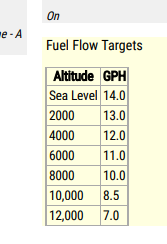
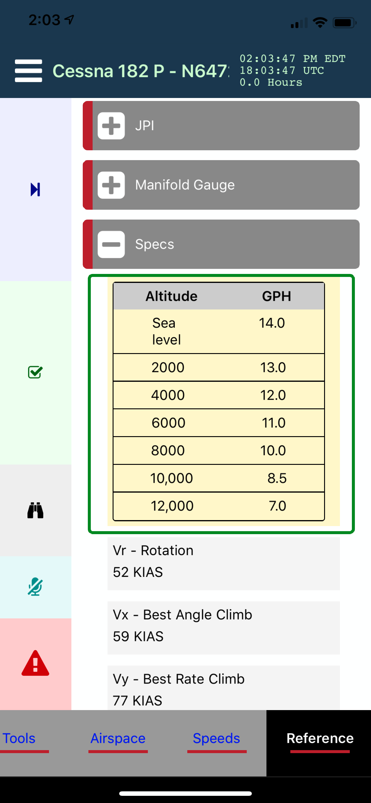
For example, in my climb checklists is a copy of the POH fuel climb/target fuel flow table:
I do somehting similar with V-Speeds to takeoff and landing. Other examples are expanded information about a checklist item.
In all of those, I only need to see it. I don’t need to check it as complete. Is there an item type which simply displays text without having to mark it complete? I thought that was what “Label Only” was all about, but I guess not.
It is correct that is what Label Only is for. Initially when you use Label Only it still acts as a check (without a visual checkbox) and you just tap on it to acknowledge it. For some content though you may not want to have to tap on it to contribute to the completion of the section. In the Advanced section of an item, there is an Ignore Completion option so that you can also say the Label Only does not need to be tapped.
Also for very small tables like this you can use Markdown to display the table inline For more complex tables you would typically put the content in the Comments which is a full blown webview. Search for the ‘Rich Content’ for some examples of Markdown.
May I bring this back to the top. I figure with all the improvements in the app over the past 3 years, this may have been addressed differently. Other than comments is there a way to place an item in a checklist without a checkbox? I tried itemIgnoreCompletion - TRUE but while it allows me to skip the item, the checkbox still appears.
I’m bringing this back up because a potential primary student has expressed interest in the app and my preference is to display information like this in the body of the checklist rather than having to tap or ask for a comment.
I think the beta “inline Comments” is what I am looking for. What’s the status of that feature?
The Inline Comments I don’t think is exactly what you are requesting. What that is for is if you add Comments in HTML which you usually have to press-and-hold the item or tap the comments icon or say SHOW COMMENTS to see a slide-up dialog of comments, inline comments embeds the comments right in the item so you immediately see them. The inline comments is only a subset of HTML, typically simple formatting and that is why it is marked experimental. Comments are meant for additional info associated with an item so there is still a Checkbox unless you set the property Label Only on the Checkbox which in that case there is no checkbox, but still and OK button that must be acknowledged. You seem like you are not wanting to have to acknowledge the item at all.
There is not yet a native feature to have an item that you don’t have to acknowledge for a variety of reasons, one being that Mira narrates each item and you are acknowledging when it is time to move to the next item. Basically there is a selected item at all times and you acknowledge when to move the selected item forward. The selected item also automatically vertically centers, but again you would need to acknowledge so it can move to the next item and vertically center. You should notice a green border around the selected item.
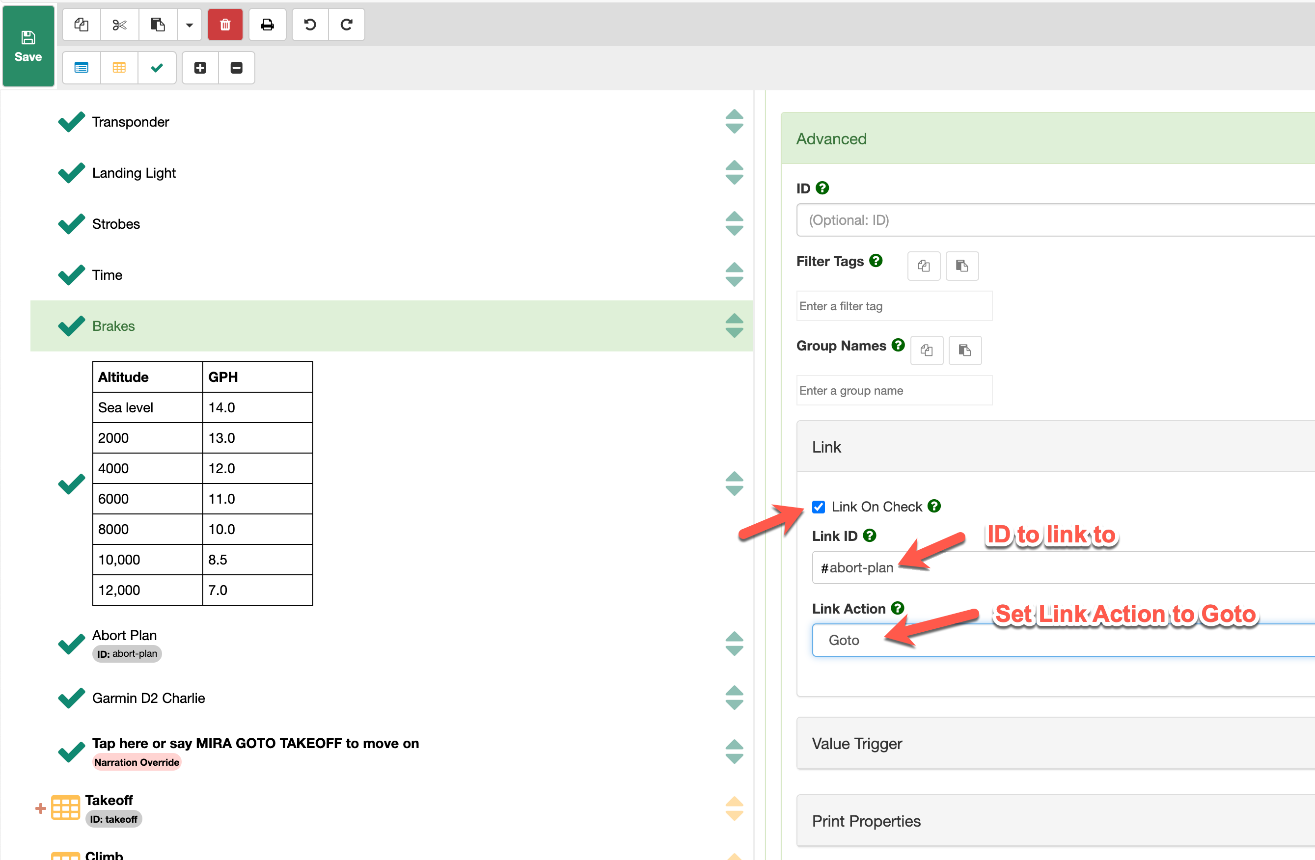
There is a workaround you can do to achieve what I believe you are wanting. If you want some text to appear in the middle of a checklist but don’t want to acknowledge it you can do it like this.
Step 1
Create a Checkbox Item with that text and set the property Label Only. This will hide the Checkbox. So you will have a card with your content only. Also scroll down and select the Ignore Completion option. This will say that the item does not contribute to completion of the section since you won’t be acknowledging it. There will be an OK button at the bottom of the card but you won’t have to tap it.
Step 2
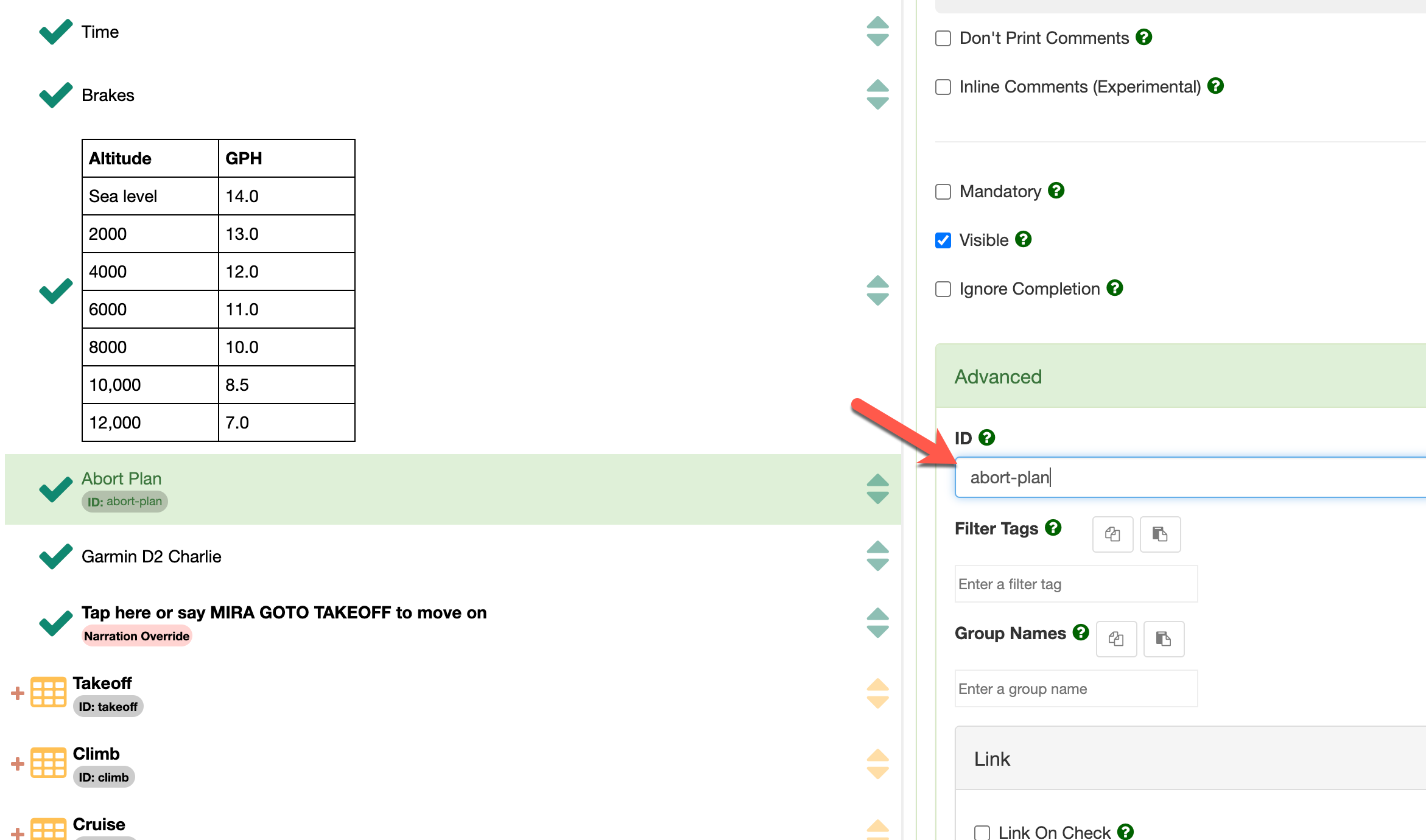
On the item following that item, add an ID on that item in the Advanced panel. A short unique ID will work. In this example I gave the ID abort-plan.
Step 3
On the item prior to that item in the Advanced panel go to the Link panel and check Link On Check. Then put the ID you want to link to (the one you previously entered) and set the Link Action to Goto.
NOTE: The ID you are linking to should have a # before it, so #abort-plan in this example.
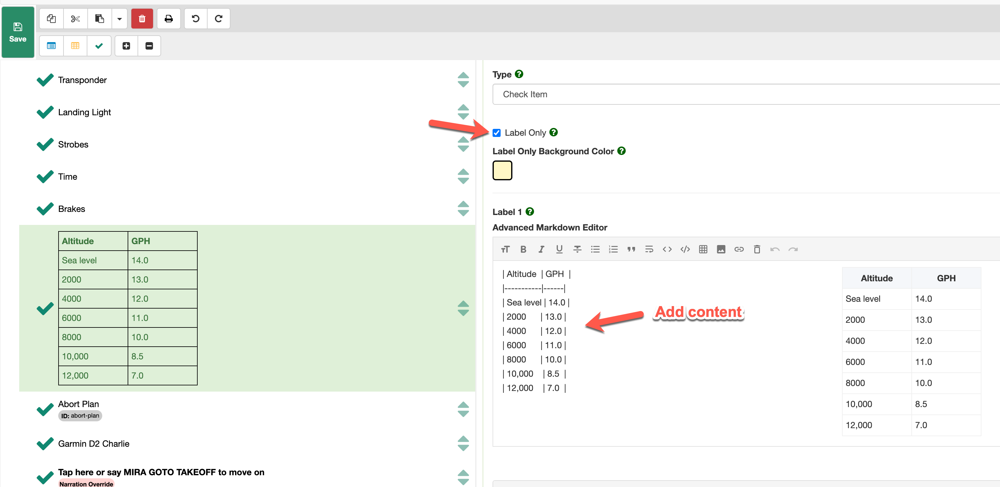
Playing around a bit, I came across a slightly different solution that seems to work for me, most of the time anyway. For that target fuel flow table for example, it’s going to be associated with a checklist item, in this case Climb. I don’t think this capability was there the last time I worked on a checklist, but it looks like I can create the table in Label 2 or Label 3 and have it presented together with the item which is to be checked off. I did that, ran through the checklist on my pone and it works.
The only area where I don’t see a workaround is subheadings within a checklist. For example, my takeoff checklist has a “Safe Altitude” group with the things to take care of when at a safe altitude. It’s basically just a heading which I set up in a different color to mark it as one. I don’t see a way to avowing having to check it off. Yes, “Label Only” avoid a checkbox but you still have to give it the “OK”.
Yes, the other labels have always supported been able to enter rich content just like Label 1 and if the content is associated with a Check Item then it works. I understand your use case of also wanting a subsection heading, but this is not supported yet. The workaround I gave could work for that but it is acknowledged it is not exactly the same thing and not ideal.
You may or may not be aware that you can change the layout of the checklist under the Appearance menu from Horizontal to Vertical. Some users prefer vertical and some prefer horizontal. With Vertical layout, you could pull off what you are trying to do with the subsections a little more elegantly. Because Vertical stacks all sections, you could just create another section and color the background. It is acknowledge it is not truly a Group, but if just looking for a visual breakpoint of a subsection it can work.
If you don’t want to use Vertical, you also could change the Font Color of Label 1 on the first item in your subsection and in Label 1 put the content Safe Altitude, and then in Label 2 put the content what would be the first things you would want to check. Again I understand not truly a proper Group, but you would have a visual indication of a subsection break.
We do have the concept of Groups as you speak of in our enterprise product and will put it on the roadmap for a future enhancement.
I do the multiple labels with different colors for some other items. At this point, the “OK” for move on from the heading will work. Besides, it’s for a potential student, not for me, so it may get modified anyway. I try to explain where what I do may not be standard for others and he may winding up using Mira more than I.
FYI, I made a small mistake when showing the linking above and fixed it. When linking to an item within a checklist you need to prefix the ID with a # sign, so in the example above #abort-plan. This is similar syntax as HTML where you link within a webpage.