Can we get back the light cloud theme? White text on a black background is not great for editing.
2 Likes
Hi @Boatguy,
thanks for the feedback!
Can you give us a few days with this, please? We will see if we can find a fast solution to get you the light theme back.
Long-term, we are happy to consider bringing back the light theme as an option the user can select (similar to the app). However, with more and more apps & products adapting a darker theme, we made the decision to take that step as well as a default.
Out of curiosity: Is the wish to get back to the light theme more a general request for the overall appearance, or have you noticed a specific area in which the light theme is needed specifically? If so, we are very happy to optimise the appearance of the new color theme to work even better.
We will definitely keep you posted on the updates and improvements we make and look forward to hearing more feedback from you on how to create an even better UI.
Happy Landings,
Mirko
on behalf of the Goose - Team
Great idea, I have reverted to the original MiraCheck download with the light background theme.
Agree with above, with regards to Mira Cloud editing. White is such a better interface for creating checklists (same as this forum is white). I understand the colour style you’re trying to do- but it looses functionality.
Separately with this dark theme, its created problems with hyperlinks/URLs in both the app and cloud website… I use a lot of hyperlinks in my Checklist item titles too (open apps/run shortcuts, etc). Because URLs are always blue text colour, it makes it hard to see the title text with dark shading colours behind. And if you try to setup or edit a URL/hyperlink on the Mira Cloud website in the text editors (for example Label 1)… there’s no text shown now because of colour scheme forced. Even the text style dropdown boxes in Label 1/2/3 (for example) show blank texts because of background colour clashes.
Then in the Miracheck app if you long press on any checklist item to load “Comments”/“Notes”, the forced grey background in text field makes it difficult to read saved text.
It’s a shame because the old white background scheme on Mira Cloud was extremely well perfected. And as far as app goes, I’m forced to use the old style (white) due to clashes with text colours and checklist item background shading if I use the new dark scheme
(I’ve also submitted feedback via email that on first main page of Miracheck app on iPad, if you click the settings ‘cog’ on the bottom right - it just loads a blank white screen , as the text is white and background is white?. This screen has been blank for several updates. Currently on 6.0.6)
Hi Tim,
thanks for the detailed feedback, that is very helpful!
Yes, I do understand the issue with hyperlinks in the header which have dark background.
I am not sure, if I understood the problems with your text fields correctly, but will try to help.
We are constantly trying to improve the look & feel and remove bugs or potential contrast issues that came through the updated theme. That being said, we also recently published a few new versions which fixed some font colours.
If you still have a problem, that looks different to my screenshots, please try to clear your browsers cache and refresh the page.
This is how the website looks today (7.1.1.662).
If that is what you are referring to, I assume you are talking about the way the links are displayed here, within the checklist editor (red circles).
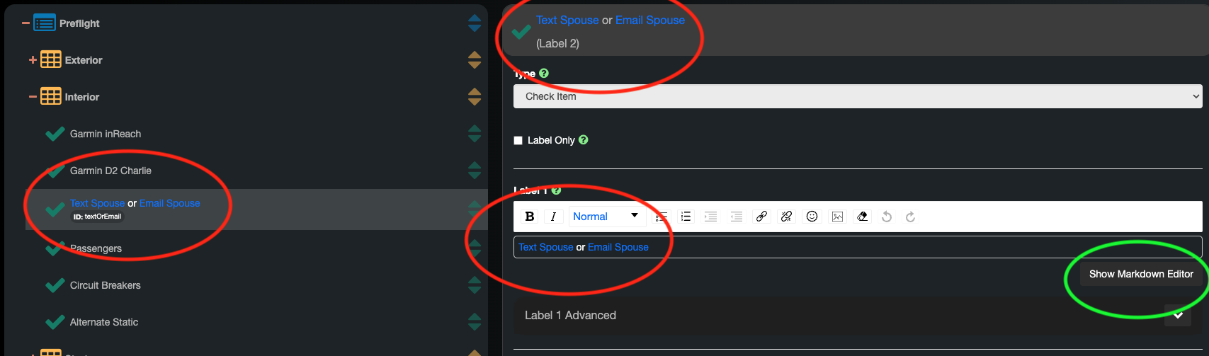
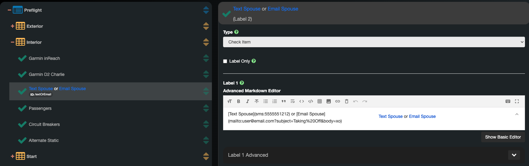
You can always “show Markdown Editor” to see the editor with white background. This did not change from the MiraCheck style providing a white background.
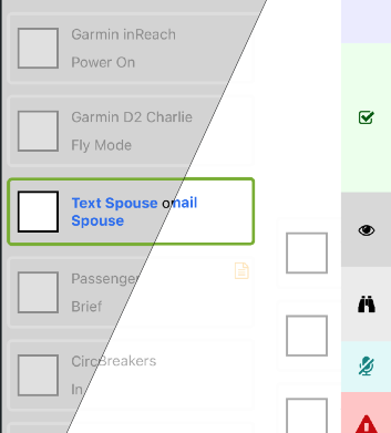
In the current version of the mobile app (6.1.0) there should not be a big restrictions in visibility either. The background turned from the bright white to a very light grey. See below: left: Goose; right: Mira Theme
I was unable to reproduce your error with the blank white scree on settings. Please try updating to the iOS app 6.1.0. If the problem persists, it would be very helpful to get some screenshots for better understanding and reproduction.
Your can also reach out to support@aerosys.io. This mailbox is monitored by multiple colleagues and myself to ensure a reply as fast as possible!
That all being said, we are constantly working on building a solution which provides the best possible user experience. Including the capability on selecting a preferred color scheme as your personal default.
I hope that helped. If not, let us know ![]()
Many thanks, for supporting us on that journey and for giving your feedback
Happy Landings,
MIrko
iPad App for MiraCheck
- Regards Support,
I have lost / disappeared my iPad App for MiraCheck together with all my check lists
Only Goose copilot with “Test Function / End of Check List” opens.
I prefer the light colour graphics and layout in MiraCheck to the dark layout in Goose
Are you able to please restore MiraCheck or can I somehow?
Best wishes -Peter Mitchell
Hope you aren’t expecting a reply from the developer here. He hasn’t bothered to be involved here for a long time unfortunately
Got more chance asking the question on his new project over here : GitHub · Where software is built
Thank you tim. I am still awaiting a response but in the mean time I was advised by an eMail provider -
“ The address to which the message has not yet been delivered is:
support@aerosys.io
Delay reason: host lookup did not complete”
Seems that the new owners of MiraCheck are not willing to provide any support and are concentrating on the “dark theme” Goose
Looks like website down too